by Jennifer Kleiber
Genre
Education, Education theory
What Was Done
Interior Design
What They Wanted
My client told me they had an author who had written a book for educators. They needed someone to take all the charts and and information and put it together in a way that it didn't feel too heavy.


The Project
Most of the books that I tend to work on are nonfiction books in the business and self-help genres. When asked to work on a book intended for educators, I was a bit hesitant because I’ve had little, if any, experience with the education field as a genre.
After taking a peek at the manuscript, I saw it was written in a way that was much like the other books I’ve worked on. Just a different audience. But the information was dense. If I just let the words flow, it would look intimidating to anyone. There’s also a lot of side information and charts.
I decided that the main body text would be set in Adobe Caslon. Caslon is seen in a lot of academic texts, so I know it’s a great font for readability and text-heavy books to keep tired eyes from getting too tired. To help keep the book looking modern and fresh, I also decided on pairing Adobe Caslon with a sans-serif—Proxima Nova Condensed. It has a ton of weights and the condensed version looks a bit more sleek than the non-condensed version. Jennifer had subheaders and subheaders for those subheaders, so I really needed different weights to help guide the reader and let them know where they were in all of that (were they still on a heading 3 section or did they enter a new heading 2 section?).
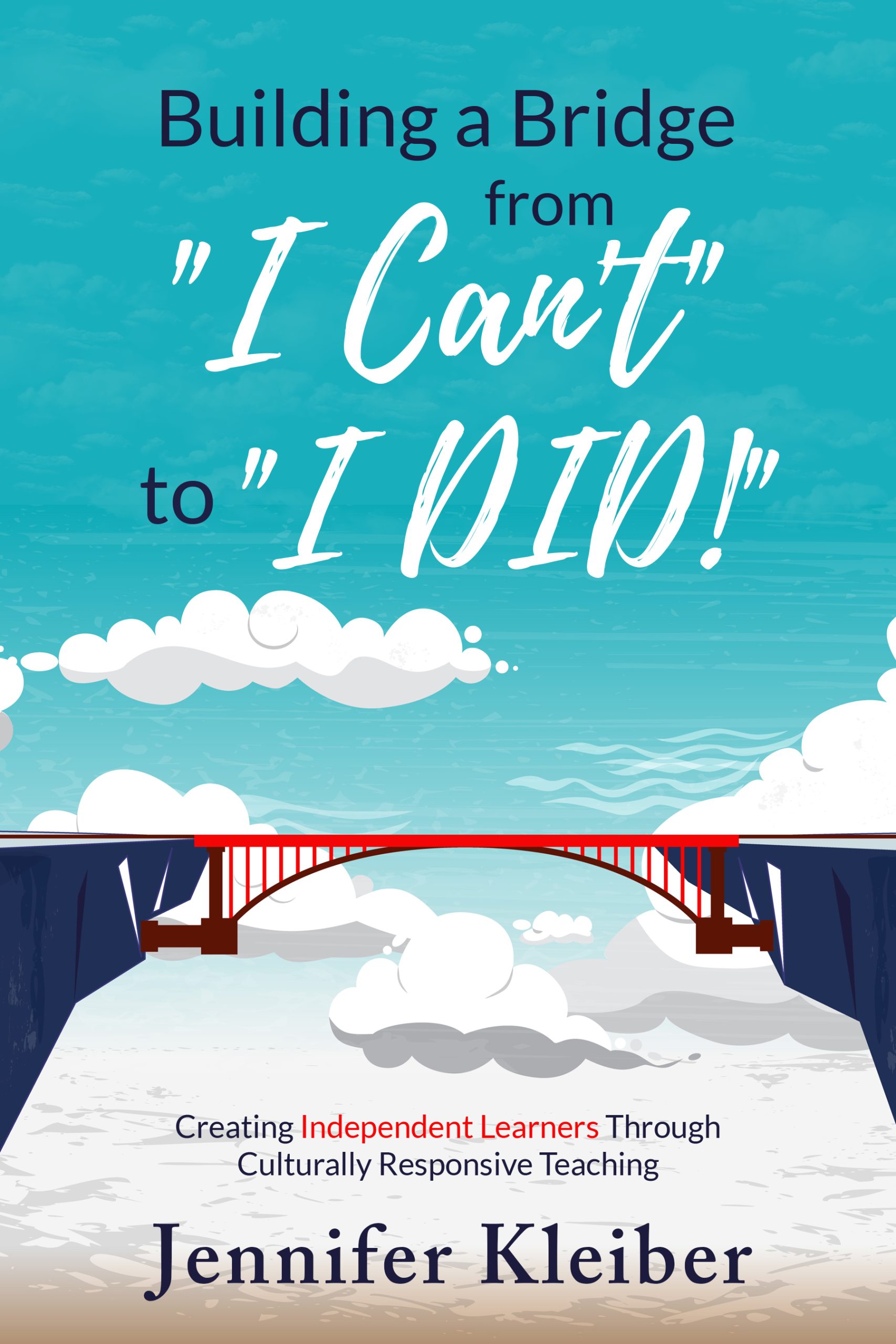
The one thing Jennifer did request was bringing in a touch of feminineness in the book. I used the font Playlist from her cover to help tie things in together. Also from the cover? I was really inspired by the clouds and bridge motif and thought it would be fun to have a bridge running across the bottom of the main pages. The clouds can be seen on all of the part introduction pages.