
by Mark Wayne McGinnis
Genre
Science fiction
What Was Done
Cover Formatting
Interior Design
ePub Production
Cover typography facelift
Interior Design
ePub Production
Cover typography facelift
What They Wanted
Mark is always churning out books. He always knows exactly what he wants and how he wants to present himself visually, which always makes my job a bit easier.


The Project
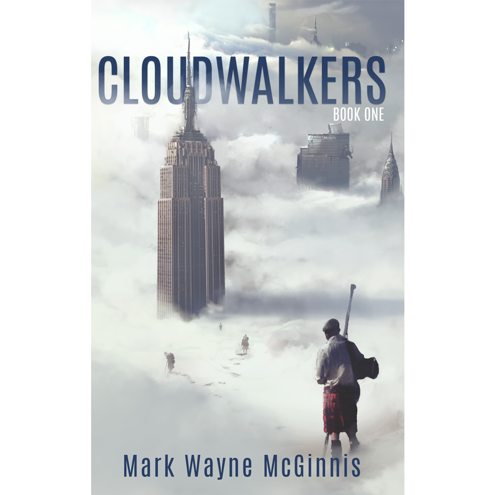
The author sent me his latest book to put together. This one was unique in that I got to edit the typography a bit on the front cover. I knew the author was a sci-fi writer, but I had never read his work. After having read the book description, I thought that the original bold font he had on his cover felt too masculine and militaristic in a genre that’s known to be hyper-masculine. His book sounded appealing to women, so I thought adding a thinner font with a blue that wasn’t as saturated and with a gradient that wasn’t as heavy would be the best way to go. I wanted to evoke the same welcoming feeling that The Martian had for both men and women for this book.
I also wanted to play with the title. So when I went to create the interior design, I thought adding a soft gradient to the titles would be nice to kind of evoke the feeling of clouds.