by Carlos Puga
Genre
Humor, Parenting
What Was Done
Cover Formatting
Interior Design
Cover Typesetting
Interior Design
Cover Typesetting
What They Wanted
Carlos was looking for a person who could take his picture book and format it correctly for his printer. I took a peek at his illustrations, listened to his pitch, and immediately fell in love with the book. Despite my lack of experience working with any kind of picture books at that time, I managed to convince him to give me a shot.


The Project
It’s not every day that someone comes to me and tells me about their book and I feel the need to move mountains to convince a person that I’m the one for the job because I want to work on the project and help bring it into the world as much (if not more than) the author. But this was one of those projects. If Carlos had said, “Hey Sheenah, part the sea and the job is yours,” I would’ve found a burning bush and convinced God to let me part the sea for just a second.
The illustrations speak for themselves. I don’t know who the illustrator was, but their art is so wonderfully lighthearted and perfect for this. And once I got the manuscript, I couldn’t help but laugh. This was a book that I felt might help ease some parents-to-be and something I haven’t seen a lot of out there. And I desperately wanted to be a small part in helping this book get published and out into the world.
Putting together a picture book isn’t the most difficult thing in the world. You add the image in, make sure everything is the right resolution, panic a bit when you’re not handed the right resolution images, and then figure out “how am I going to lay out the text?”
Carlos had some early ideas about fonts and what he liked. So I played around with some settings until we were both happy with how and where all the stanzas were placed.
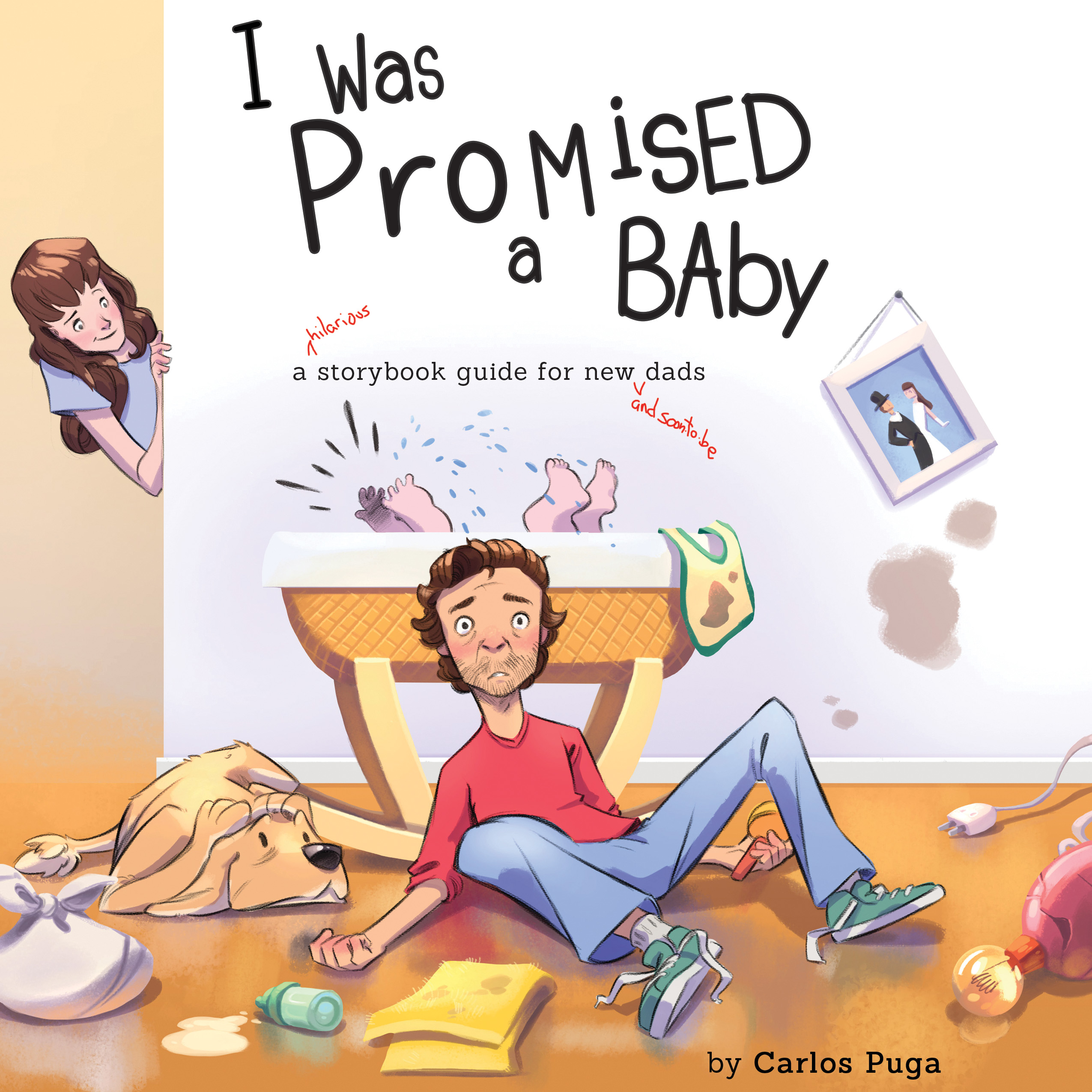
I was also in charge with the formatting and typesetting of the cover. I was sent the illustration to be used for the cover and Carlos’s request was he wanted the title to look handwritten and messy. I don’t remember how many fonts we went through and styling, but I do remember that it was a lot. We scoured some children’s picture books and took a peek at how those were done. At some point I wondered if it would be better to do hand lettering and did I feel confident enough in my hand lettering techniques to even do that? Eventually, we did find a font that we both really liked and with some very careful placements and tweaks, I believe we finally got there.
The subtitle where the letters are in red? Totally my handwriting. Sort of. He said he wanted it to look like a proofreader scribbled something in and I remember stressing out about finding more handwriting font when I remembered “Hey, I have a drawing tablet.” So I scribbled the words that were needed (making sure to be extra sloppy) and it really helped bring it all together.
The project was an absolute joy.