Genre
What Was Done
Interior Design
ePub Production
What They Wanted
A relative of Charles Smith came to me and said he was looking for a person who could help him take this manuscript into a book. The manuscript were pages from his great-grandfather's journal that he had managed to transcribe and research and put together mostly as a family keepsake. The added ability to put it up on Amazon seemed to be a bonus in case anyone else were to come across it and wanted to glean information from a first-hand experience about life in the late 1800s/early 1900s in the Great Lakes area of North America.
The Project
There’s a special place in my heart for projects that are meant to be family heirlooms. This was interesting because the author of the original manuscript was already gone. He had been gone for over fifty years and his great-grandson had taken it upon himself to ensure his great-grandfather was remembered in the family. Maybe I’ve been watching too much Coco, but that stuff tugs at my heart strings. I take care of everybody’s books with care, but I feel like I put in just a bit of extra love and attention to projects like these.
He didn’t really know anything about publishing, so we had a long discussion about publishing options and where to get the book printed so he could gift copies to his family. What would be needed? Could he sell the book on Amazon, too? Was that possible? In the end, he agreed to wanting both print and ebook options so he could sell the book on Amazon and see what would happen. You miss every shot you don’t take, right?
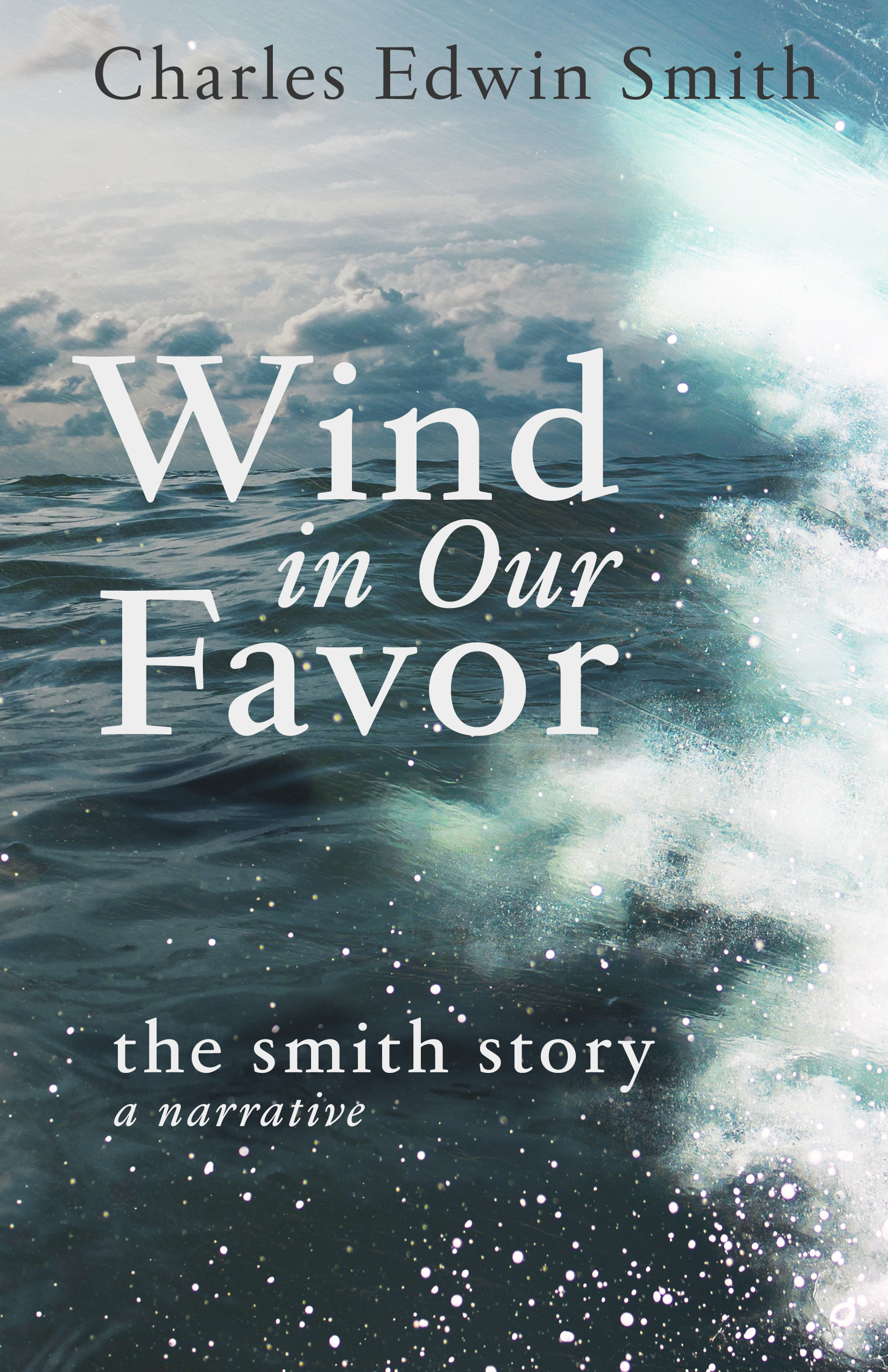
In his cover questionnaire, he mentioned he wanted something possibly adventurous/exciting. I presented him with three different mockups that all had a different kind of feeling/tone. He was immediately drawn to the mockup that looked quite a bit like the final cover. There were a few tweaks that were needed, but it was rather quick to figure out.
I wanted to keep everything simple. This was some sort of journal transcripts from a man who was alive in the late 1800s/early 1900s, so I thought about the books and the art from that time period. I also wanted to keep everything classic, but modern. So the font on the cover is what I feel to be rather timeless. It’s managed to survive decades and it’s easy to read. To kind of bridge the gap between the then and now, I used a more sleek and modern font for the footnotes in the interior.


