The Project Dave contacted me because I had done some work a year or so before for his business partner, who liked my work enough to recommend me. He had a personal development book that he felt strongly about, but he didn’t know what to do or how to get what he wanted. We had a lengthy discussion about expectations, pricing, publishing models, pretty much anything and everything publishing related. He told me that one of the things he really … Read More
Cloudwalkers
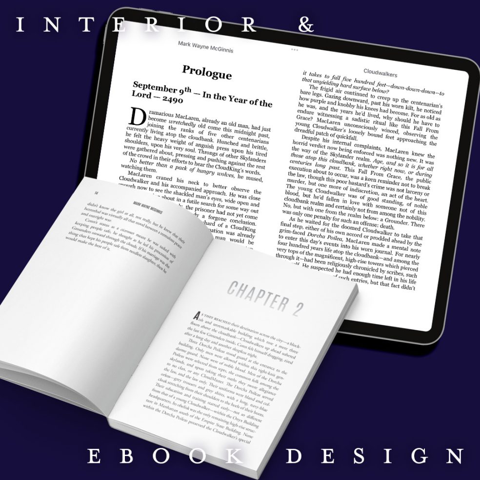
The Project The author sent me his latest book to put together. This one was unique in that I got to edit the typography a bit on the front cover. I knew the author was a sci-fi writer, but I had never read his work. After having read the book description, I thought that the original bold font he had on his cover felt too masculine and militaristic in a genre that’s known to be hyper-masculine. His book sounded appealing … Read More
Stronger Than The Master
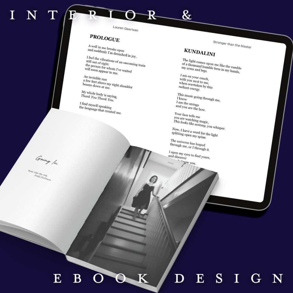
The Project The author contacted me because she wanted to self-publish her book of poetry. Poetry always presents its own problems because there are so many different sorts of forms and sometimes dangling words. Luckily, the author had fairly straightforward poetry verses that didn’t require any super special formatting. The biggest problem for me was trying to figure out a timeless font that worked well with the cover of her book, which to me, evoked a timeless ethereal feel. On … Read More
The Memory Keepers
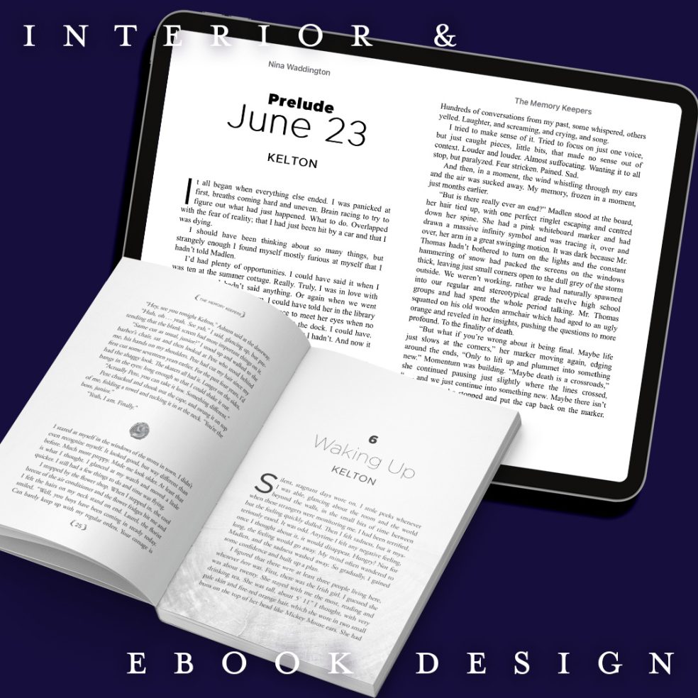
The Project The author really wanted that piece of wood that’s featured on her cover somehow incorporated into the interior. I believe we had discussed possibly using it as a paragraph break. After learning that the book was intended for the YA audience and taking a closer look at the cover, I had this idea of using a wood look for the chapter title pages. Because it was a YA book, I also felt that I could play around with … Read More
Brand Real
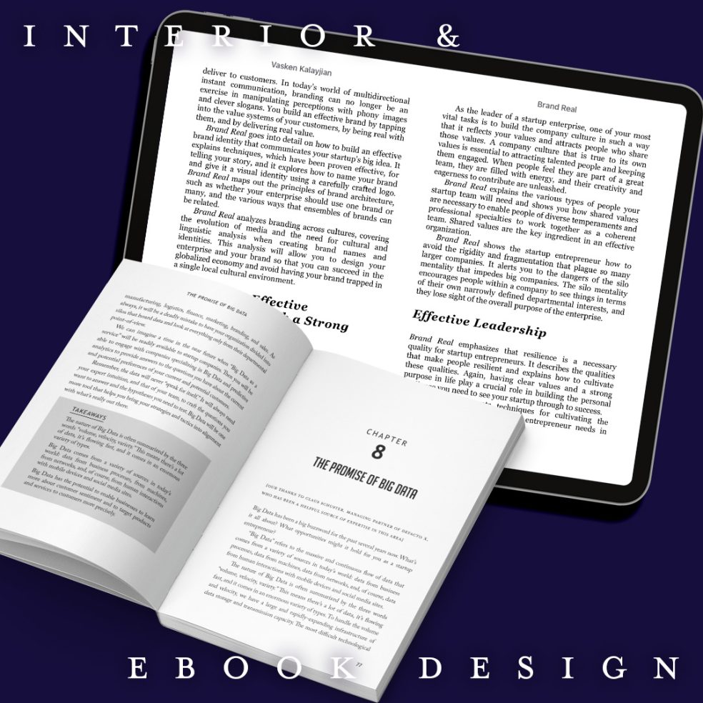
The Project When the author approached me with this project, I was initially a bit intimidated after seeing his extensive knowledge in design. The guy has worked in corporate settings and has worked on national branding projects. Originally, I was supposed to do something minor because he had laid out the book himself. But after taking a look through his initial layout design, I realized that it needed to be modernized. I approached him about updating his layout design and … Read More
- Page 2 of 2
- 1
- 2